HELP Please
Printed From: OHbaby!
Category: General Chat
Forum Name: General Chat
Forum Description: For mums, dads, parents-to-be, grandparents, friends -- you name it! And you name the topic you want to chat about!
URL: https://www.ohbaby.co.nz/forum/forum_posts.asp?TID=44188
Printed Date: 20 May 2026 at 11:29am
Software Version: Web Wiz Forums 11.10 - http://www.webwizforums.com
Topic: HELP Please
Posted By: AngieBaby
Subject: HELP Please
Date Posted: 10 July 2014 at 1:03pm
|
Hi everyone... In the interest of improving the site all the time - I've been wondering if the home page to our forums would be better looking like the below screen shot... then the forums specific to each category are displayed on the next page... Am I just being to fussy and wanting everything to look pretty when it's fine as is? Or would our forums benefit from a spruce up? Thanks in advance for your opinion! Ang 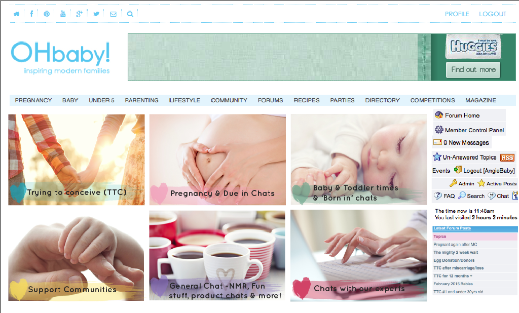
|
Replies:
Posted By: #KatieB#
Date Posted: 10 July 2014 at 1:11pm
| Looks good :) Was worried you were going to say something about getting rid of them or something!! Def makes it look easier to navigate :) |
Posted By: AngieBaby
Date Posted: 10 July 2014 at 1:18pm
|
:) Thanks Katie, don't worry won't be getting rid of them - too much valuable information available to mums from other mums in here:) so...do you think that not having all the links from the forum home page is okay? (to all the different discussion) and it's clear what you're going to get when you see these images? |
Posted By: SouthKiwi
Date Posted: 10 July 2014 at 2:42pm
|
Looks good! It would be nice to keep/have the latest posts list n the forum home page. It makes it easier to keep up with new posts :) ------------- http://lilypie.com" rel="nofollow">  
|
Posted By: skiltz
Date Posted: 10 July 2014 at 3:14pm
|
You can click the "Active Posts" at the top of the forum homepage to see all new posts since your last visit. |
Posted By: Apfel84
Date Posted: 10 July 2014 at 3:40pm
I like that picture menu, it looks great 
|
Posted By: Storm11
Date Posted: 10 July 2014 at 3:42pm
|
The new site gets my vote I think it looks great! ------------- TTC #2 6+ yrs. Multiple chemical losses, 4 IVF rounds, multiple FET's. Fingers still crossed for a miracle to come our way 
|
Posted By: LiBi
Date Posted: 10 July 2014 at 4:15pm
| That looks much tidier, good work! |
Posted By: AngieBaby
Date Posted: 10 July 2014 at 4:34pm
|
thanks ladies! lovely pic LiBi :) |
Posted By: Nellennium
Date Posted: 10 July 2014 at 4:49pm
|
Looks good Will there be an update/new look for the mobile view?  -------------  4xMC, 3xMMC  http://nellennium.blogspot.co.nz" rel="nofollow - Blog: Nellennium Ramblings |
Posted By: AngieBaby
Date Posted: 10 July 2014 at 4:51pm
|
not a big one Nellennium - is there anything you would like to see changed? We're looking at changing colours etc but the software we use doesn't allow us to do much else unfortunately and we can't change as we'd loose all the conversations over the past 13 years :( :) |
Posted By: Nellennium
Date Posted: 10 July 2014 at 4:59pm
|
Fair enough, it works well enough for now. Would be good if the text reply box resized to fit screen instead of running off. Also having the smilies open on the same page instead of opening a new window. I'm sure there's other things but they are the ones that are the most annoying, oh and the option to see signatures Do you use forums through a provider? ------------- 4xMC, 3xMMC http://nellennium.blogspot.co.nz" rel="nofollow - Blog: Nellennium Ramblings |
Posted By: AngieBaby
Date Posted: 10 July 2014 at 5:06pm
|
Ah yes. Using from mobile now and I can see what you mean. :) We use software we originally started the site with and get all their updates but the updates aren't exactly life changingly Awesome :) but good we have a mobile version and it's easy to use |
Posted By: AngieBaby
Date Posted: 10 July 2014 at 5:08pm
| I'd love to be able to add friends and tag them too :) |
Posted By: Justas
Date Posted: 10 July 2014 at 10:19pm
|
Hi Angie, Yes this more visual version of the forums is wayyyy better to look at visually. Way more enticing to read than what it is currently like. Personally I think the whole site really needs a redesign, but thought I'd better not mention that when we spoke the other week. Justine |